Easing the registration process
The Objective
Unsolicited and scam phone calls are annoying to everyone who owns a cell phone and can put your information at risk. In order to stop these unwanted calls, cell phone users can enlist their phone number on the Federal Trade Commission’s “Do Not Call” Registry, removing their number from databases.
Users need a simple, quick, and direct process to add their phone to the “Do Not Call Registry” to feel assured that they have done what is needed to give them relief.
My team’s objective was to improve the difficult process to register your phone number to the “Do Not Call” List.
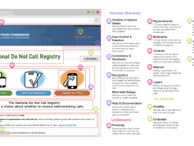
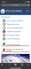
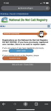
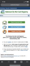
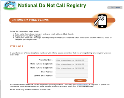
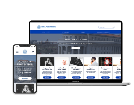
Examples of Current User Interface

Usability & Interface Improvements
The Result
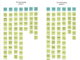
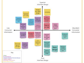
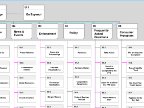
After gathering user research and identifying the users’ needs, my team and I developed an improved interface design and more comprehensible registration process.
Through testing the current Do Not Call list registration process, we found that people got frustrated with the process or were unsure if the registration worked.
We created a more concise, clear, and mobile-friendly registration process that ensured phone users that they succeeded in adding their phone number to the national registry.


